About the brand:

Nutri is on a mission to transform ordinary mornings into extraordinary beginnings. They understand the significance of a nourishing breakfast, and are committed to providing products that fuel your day and set you on a path to success! Energize your day with Nutri!

The Challenge:

The challenge with designing Nutri lay in striking the delicate balance between visual appeal and conveying the brand’s commitment to health and nutrition. I needed to create packaging and branding that not only looked inviting and appetizing but also communicated the brand’s core values of wholesomeness and vitality. It was essential to ensure that the design was versatile enough to cater to a wide audience, from health-conscious adults, to families seeking convenient breakfast solutions.

The Outcome:

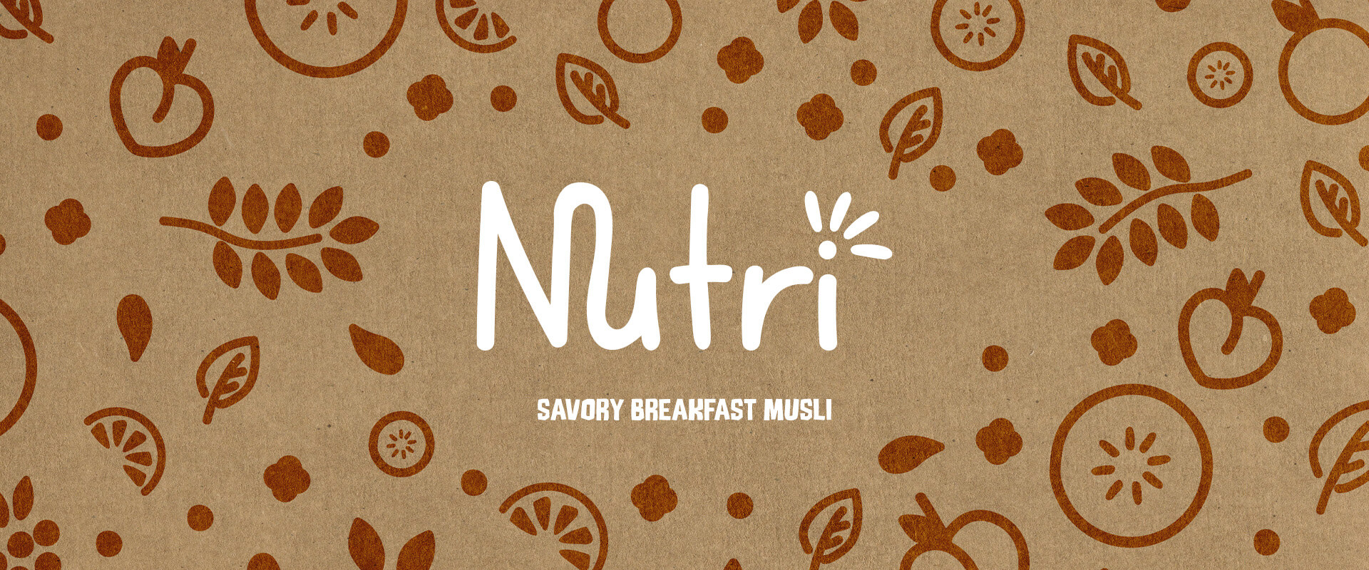
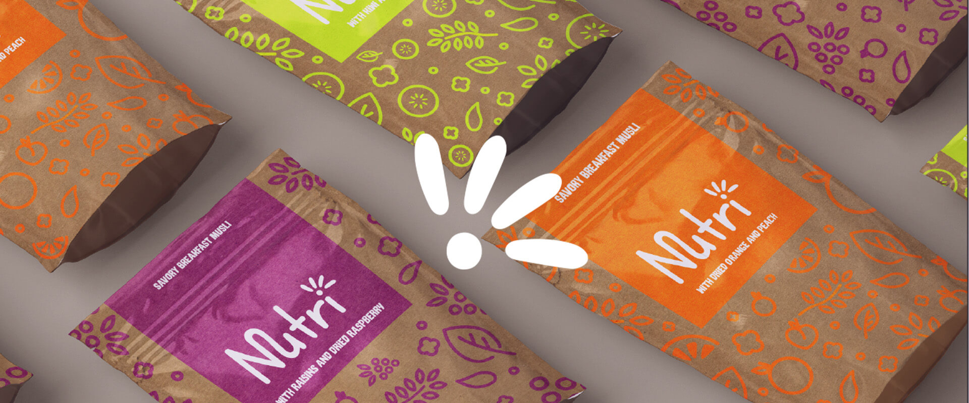
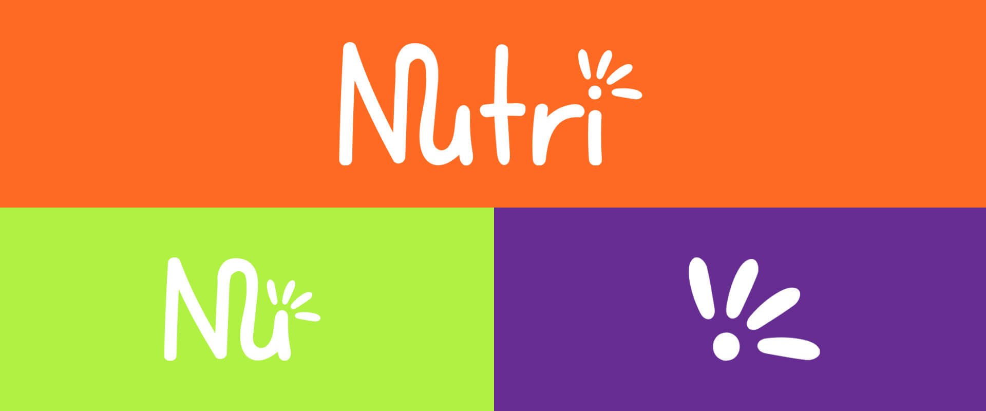
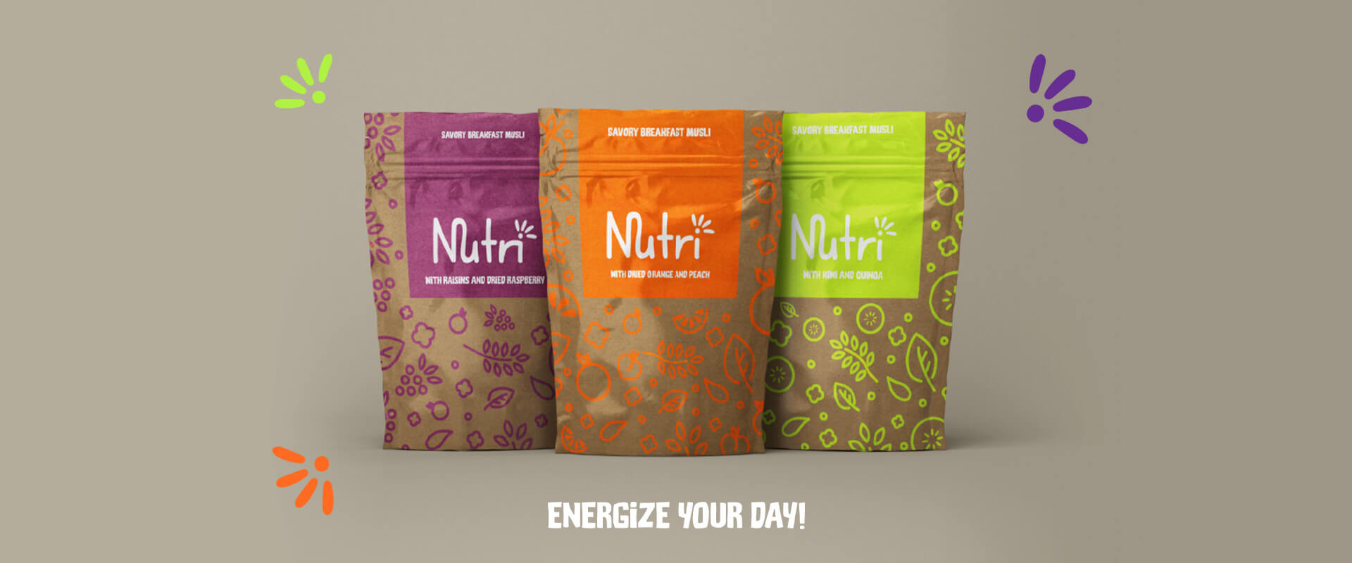
The outcome was a vibrant and engaging design that harmoniously blended aesthetics with the brand’s mission. The use of bold and vibrant colors conveys the sense of excitement and freshness that comes with a new day. 

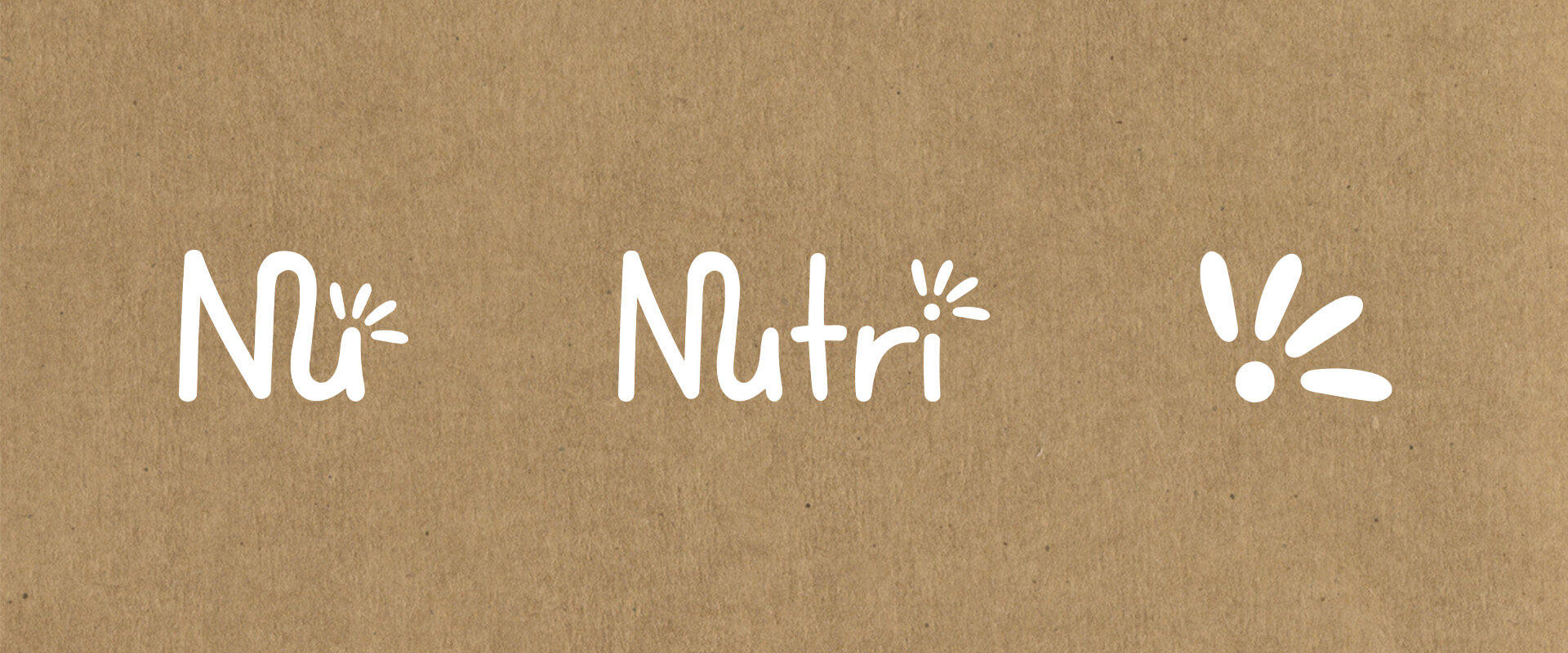
The logo, with its sunrise element, symbolized the brand’s commitment to energizing mornings. This design approach helped Nutri establish a strong visual identity that resonated with consumers, making each product not just nutritious but also visually appealing, ultimately contributing to the brand’s success in the market.

Colour Palette:

The selection of vibrant, bold and playful colors for Nutri was a deliberate choice to effectively showcase the diverse tastes of these organic breakfast cereals. These lively hues and patterns were specifically curated to not only capture attention but also convey a sense of excitement and flavour variety.

Logo Variations:

I created three logo variations for Nutri, to establish a versatile brand identity: 

Main Logo: This is the core brand signature, displaying the full “Nutri” name in a fresh and readable font. 

Logo Mark (sunset symbol): An elegant sunset symbol, representing energizing mornings, for instant recognition and memorability. 

Favicon Logo: A compact icon combining the first two letters of nutri and the Logo Mark for use in digital space, ensuring consistent branding. 


These logos provide Nutri with a cohesive and adaptable identity strengthening brand recognition across all platforms.


Packaging Design:

By employing such dynamic colours and patterns to the packaging, it conveys the deliciousness within, instantly inviting consumers to experience the flavours that Nutri has to offer. The packaging becomes a window into the world of taste awaiting discovery, making the choice to embrace healthier, natural ingredients to energize your day, all the more enticing!

Ready to elevate your brand?